In order to attract more clients, and in order to keep all the ones you already have, you should facilitate and work on getting the best UX design you can. However, understand that you are not the only one who thinks in this manner. Programmers, designers, coders, and in general anyone who wants to create something using computers already understands this. Put simply – you need to find a way to stand out. Whatever you have at your disposal, you need to use it.
Every single resource, asset, and a piece of information. Keeping all this in mind, there is one bit of information that is rarely used. Namely, we are talking about the psychological and emotional aspects that stand behind a modern UX design.
People have problems with this idea. Some don’t know anything about it, while others feel it’s a bit…cold, a bit clinical. In fact, no matter how much coding and programming it requires, UX design is still something of an art. So, moving away from something that is simply creative, to focusing on a clinical notion like psychology is not welcomed warmly by all.
However, what these people fail to grasp is the fact that psychology is behind every design choice that works. Every single thing that can elicit a reaction in people, that can get them to remember your product, or to find it easy to use, is based on ancient parts of our brains. It is this framework that you need to understand and tap into if you want to get the best results.
This concept is about understanding what makes people tick, what makes people make the choices they make, and why do they make them. You want to figure out what draws peoples attention, and what overwhelms people, what makes your users frustrated. By understanding these notions, you will have a much deeper knowledge, and effective, behind all of your design choices.
The importance of colors and emotions
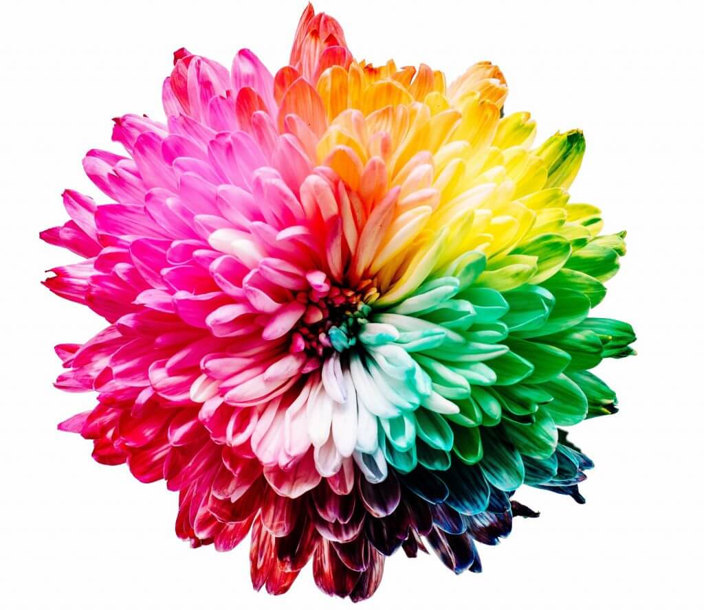
Colors have this amazing feature of directly influencing our emotions and moods. Furthermore, this all has an evolutionary background (to the extent that we understand this, of course). For example, we associate green with nature, quite obviously, because trees, plants, vegetation – it’s all green. Red is life and aggression because it’s the color of blood, yellow is warm and soothing due to being the color of the Sun, etc. By utilizing every color, shade, and contrast, you can elicit exactly the reaction you want from your consumers.
Now, without going into too much detail, understand that all colors have, roughly defined, three elements. Contrast is having one color be the exact opposite of another one on the color wheel. Complementation is a feature where two different colors complement each other, instead of clashing with each other. Finally, we have vibrancy.
This is, to put it simply for the purposes of this article, the shade of the color. So, the difference between lighter and darker colors, where lighter shades are energizing, while darker ones are soothing and relaxing. The reason all of this is important is that there is a ninety-second window where people receive an impression about a certain product.
In fact, studies have shown that red, yellow, and orange provide a stimulating effect on people when taking certain medication, even though it was all the same medication, colored differently.
So, for example, red is energizing, it increases blood circulation, and is associated with power. It attracts and pulls attention in, but it also serves as a warning. It can call attention to a certain point you want your users to be aware of.
However, it can incite anger. So, if you want to draw attention to something when using red, understand that most likely this attention will be negative. However, dark red gives off a sense of power and stability, while bright red is all about urgency and speed. On the other hand, black can be both an excellent dominant and supportive color. Standing alone, it gives off an air of sophistication and domination. It can also seem dreary and depressive. When compared with white, it is an excellent choice for minimalist designs.
Blue gives people a feeling of certainty and reliability in darker shades, and associations of openness when going with lighter variants. Light blue is cheery and happy, while dark blue is melancholic and sleepy. Yellow, on the other hand, is enthusiasm and energetic, if not the most energetic. However, if you go with a golden, darker yellow, you can facilitate the emotions of antiquity and class. Dark yellow with black gives off an especially regal look. White is pure at best, sterile at worst. It’s difficult to use and needs to be handled carefully.
The limitations of our minds and the value of minimalism

One of the more important aspects of utilizing psychology for your UX design practice is understanding that our brains are essentially limited things. The best way you can look at this is by seeing the brain as a computer with limited processing power.
Now, this processing power is very high, has a huge amount of potential, and is incredibly complex. However, it still has its limitations, which present themselves (relevant to a UX designer) in a couple of ways. First, by the “paradox of choice” second, by the very fact, we have short attention spans, and third, the frustration that comes about from being unable to handle so much information.
Now, the paradox of choice is a strange facet of our minds where we end up essentially paralyzed when presented with too many choices of almost equal value and validity. Analyzing the value of a choice is important, it’s what makes us actually be able to choose. But if the options presented to us are the same (or at least, we can’t tell) then we will be paralyzed. We will be unable to make a choice and will either end up frustrated or simply unhappy with our choice. You can have the most amazing functions and features, with the best assistance and framework, and it still won’t matter much if your users can’t handle all the info.
Another aspect of the limitations of our minds is the fact that we can handle only so much information before we burn out. Constantly bombarded by external stimuli, everything forcing us to think and get our brains turning – after a while, it becomes too much. Know that this issue isn’t centered only on a timeframe lasting a couple of days.
A couple of seconds can provoke a small reaction. Now, what we mean by this is let’s take a simple website page you designed. If it’s cluttered, filled to the brim with features, images, posts, content, etc., the moment a person enters this page, he or she will want to leave. All the elements on the page overwhelm our eyes and brains, and they simply lead to a feeling of frustration.
Finally, our brains are limited by our attention spans. Now, this is a trait that we have lost due to our busy and overstimulated lives. Nevertheless, it has also been a trait for millennia. It may seem like a bad thing, but having limited attention spans means we are then able to shift our focus to things that are important, conserving our energy and resources.
The problem is, these attention spans were tied to hunting and gathering. Now, they cause issues, make us fidgety, and make us crave stimulation. In fact, a study done in 2015 by Microsoft Corp shows that according to the research acquired from studying 2000 people. Our attention spans have diminished by 30 percent in the last 18 years.
So what was the point of all of this? To hammer home just how important clarity and minimalism actually are. If you present too many options and features to your users, no matter how amazing, useful, and cool those options and features are, said users will just walk away. And too much clutter means anything from the actual design, to fill up the page with too many links, bullet points, and SEO shenanigans. Web design and SEO experts from GWM Agency, for example, will tell you that less is always more when it comes to keywords, and with the design. Oversaturation happens, and it can happen often if left unchecked. Furthermore, understand that the aforementioned Microsoft study showed that you essentially have 8 seconds to grab a user’s attention.
They will either be unable to make a choice or will get so frustrated that they will simply turn to something else. And this is relevant to features and functions that you work hard on. Another aspect is simply being sloppy with your design and making the whole website and app interface cluttered and chaotic.
Empathy and connection

You need to of course understand how the brain works in order to figure what kind of effect your work has on them. However, you also need to figure out what your audience actually wants (or perhaps, what the appropriate audience for your services and products is). It can also save yours from making a silly mistake. For these reasons, you yourself need to work on how you listen, and to improve your empathy.
Now, listening is a vital part of psychotherapy and psychology because it helps you understand what a certain individual is thinking, and why this individual thinks in the way he or she does. This can be properly transcribed to UX design as well. You need to listen to what your target audience is interested in, and then modify your work accordingly. Read reviews, comment sections offers some Q&A’s, whatever gets the people talking.
The next important part is empathy. Empathy is the ability to feel the emotions another person feels. This means everything from happiness and joy, to depression, sadness, and rage. By using empathy you can learn more about your target consumers and, more importantly, how to modify your work to provide the best possible experience. All people (with the exception of psychopaths) have empathy. However, research shows that it needs to be developed, and worked on, continuously.
Often designers focus too much on whether they themselves (and their colleagues) enjoy a certain feature or even an entire design. The problem here is that designers are not regular people. You see more of the intricacies and nuances of a certain feature, and you have a much easier time maneuvering it. In fact, you most likely made it. But, you need to tone down the complexity.
Don’t think of this as dumbing the work down, but rather, put yourself in the shoes of the layman. Try to understand how they would feel when they use your designs and your work.
By implementing psychology, by understanding how the mind and how people work, you will get a tool that not many people even think about. Too many designers let habits lead their work and their designs, not ever thinking about what is behind peoples choices, not meditating on why people make the choices they do.
Still, you just need to keep a couple of things in mind. Understand how limited our brains are. Remember that we all have limited attention spans and that we can get overwhelmed easily. Think about how colors influence our thinking and our emotions. Try to empathize with your users, walk a mile in their shoes, and leave your ego at the door. If you want to truly be unique and to stand out, you always need to think outside the box.